21 21 Design Sight in Tokyo and the National Art Center of Tokyo
Before we departed from Tokyo, we stopped by the 21 21 design sight in Tokyo. The gallery showcased all types of innovative design, starting with the architecture of the building itself. The name '21 21' comes from the English term for perfect vision, '20 20'.
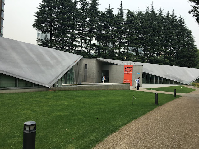
The building is nestled into a well-kept park, surrounded by glossy skyscrapers. The park seemed to offer a quiet haven to eat lunch for business people who worked nearby. The gallery was tucked away from the crowded streets in Tokyo, but still easily accessible to anyone who looked for it.
I loved the design of the flyer for their current big exhibit, entitled "How Far Will You Go?"

The flyer exhibited my favorite bold and daring design style that I saw frequently in Japan. I love the neon orange paper. Neon orange is not a color typically thought of as pleasing to the eye, but the poster embraces the color and makes it the focal point of the design. It's unexpected, it's daring, and the result is something the eye naturally gravitates toward. I also love the combination Japanese Katakana characters and English type.


The overstated, bold Japanese characters are so aesthetically pleasing!
Unfortunatey, we weren't allowed to take photos in many of the exhibits. I saw very unique graphics as well as sculpture and interactive pieces. Here are some photos of a cool sculpture that utilizes smart design.


After 21 21, we headed to the National Art Center of Tokyo, which was just down the street. This gallery was less focused on design, but I enjoyed it nevertheless. There were cool exhibits on Japanese pottery and calligraphy.


I also found a lot of posters with graphics that I liked.


Comments
Post a Comment