Reflecting on My Experience
It's been a month since I've been back from Japan and I'm back on the blog to reflect on my experience. I wanted to give myself time to make my own graphics inspired by what I saw in Japan and reflect on the trip as a whole before I made this post. I am so grateful to the HW Go program for making this trip possible for me, so first and foremost thank you!
Here's a little moment from my trip that I'd like to share:
Stepping off the plane, my mind was fixed on two things: eating something and taking a hot shower. My backpack felt heavy, a headache was setting in and the air was thick and hot. My mom's mind seemed to be in the same place, so we immediately set out to find food. The airport was clean, dimly lit and orderly. One of the stores that lined the wide path to the baggage claim, a drugstore it looked like, was glowing. Japanese characters lit in electric blue lined the top of the store. My eye immediately stuck to the lettering to take it in. Little did I know I would be seeing a lot of similar glowing signs on my trip. Then, I noticed the shelves and shelves of packaged food. My brain did a cartwheel. I swung my backpack around, snatched my camera, and snapped countless photos of the food. My hair disheveled, in my all grey outfit consisting of sweatpants and a baggy jacket, I took close ups, far away shots, solo pictures of all the packaged food. You heard me right, packaged food. My hunger ebbed and my mind wasn't on the 'food' part, it was on the packaging. The packaging had made my brain do a cartwheel. I have walked into countless drugstores before, but never have I felt a sudden urge to take my camera out and document one before. I loved the bold colors, the cute manga, the Japanese lettering, the detailing. I had stepped into a world where beauty and detail were eminent everywhere you stepped-- even in drugstores. This moment set the tone for the rest of my trip. From the moment I touched foot in Japan, I gleaned so much inspiration from the packaging, street signs, posters and advertisements everywhere I went.
This trip also reinforced what I had kind of already known: that I want to do something in the future that involves design. I felt like a kid in a candy shop in Japan. Design really is what makes me tick and spending 10 days being surrounded by such unique and abundant design truly made my heart beat faster and inspired me. The trip also opened my eyes up to other types of design I didn't know that I was interested in before. For example, Japanese ingenuity in smart product design interested me. Buying a candy bar in Japan is a different experience. Not only is the packaging more artistic, the shape might be unique and the opening mechanism might be smartly thought out to easily deliver the product. Being in a design and detail forward environment made me realize that I don't have to limit myself to graphic design but I can start fostering my interest in all kinds of design.
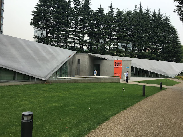
Visiting the Japanese design museums was also an incredible and unique experience. Being so aesthetically centered, Japan had so many museums focused on specific facets of design that I hadn't put much thought to before. For example, there was a museum documenting graphics in advertisements and a whole museum dedicated to anime. Overall, I went to around 7-8 museums during my time in Japan. I only chose a few to blog about because some didn't allow photos or have an online gallery and I didn't think describing the beautiful visuals in words would do the work justice.
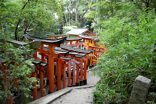
I also learned about Japanese history and culture on my trip. I visited many shrines and temples, ate traditional Japanese soba, ramen and sushi and engaged in the modern pop culture of Japan. Learning about Japanese culture was an important part of the experience as a whole and helped me understand Japanese graphic design better. Like I mentioned in a previous blog post, there's no one style in Japanese graphics. There are several unique styles that seem to be at odds with each other that somehow coexist and compliment one another. Looking at the elegant, simple historic architectural structures at the shrines and temples allowed me to better appreciate the Japanese design trend that favors minimalism, simplicity and small pops of color. Walking past Harajuku girls with twenty multicolored hair clips, glittery makeup, rainbow skirts and yellow lipstick helped me understand the more maximal and neon Japanese graphic design style.


Here's a little moment from my trip that I'd like to share:
Stepping off the plane, my mind was fixed on two things: eating something and taking a hot shower. My backpack felt heavy, a headache was setting in and the air was thick and hot. My mom's mind seemed to be in the same place, so we immediately set out to find food. The airport was clean, dimly lit and orderly. One of the stores that lined the wide path to the baggage claim, a drugstore it looked like, was glowing. Japanese characters lit in electric blue lined the top of the store. My eye immediately stuck to the lettering to take it in. Little did I know I would be seeing a lot of similar glowing signs on my trip. Then, I noticed the shelves and shelves of packaged food. My brain did a cartwheel. I swung my backpack around, snatched my camera, and snapped countless photos of the food. My hair disheveled, in my all grey outfit consisting of sweatpants and a baggy jacket, I took close ups, far away shots, solo pictures of all the packaged food. You heard me right, packaged food. My hunger ebbed and my mind wasn't on the 'food' part, it was on the packaging. The packaging had made my brain do a cartwheel. I have walked into countless drugstores before, but never have I felt a sudden urge to take my camera out and document one before. I loved the bold colors, the cute manga, the Japanese lettering, the detailing. I had stepped into a world where beauty and detail were eminent everywhere you stepped-- even in drugstores. This moment set the tone for the rest of my trip. From the moment I touched foot in Japan, I gleaned so much inspiration from the packaging, street signs, posters and advertisements everywhere I went.
This trip also reinforced what I had kind of already known: that I want to do something in the future that involves design. I felt like a kid in a candy shop in Japan. Design really is what makes me tick and spending 10 days being surrounded by such unique and abundant design truly made my heart beat faster and inspired me. The trip also opened my eyes up to other types of design I didn't know that I was interested in before. For example, Japanese ingenuity in smart product design interested me. Buying a candy bar in Japan is a different experience. Not only is the packaging more artistic, the shape might be unique and the opening mechanism might be smartly thought out to easily deliver the product. Being in a design and detail forward environment made me realize that I don't have to limit myself to graphic design but I can start fostering my interest in all kinds of design.
Visiting the Japanese design museums was also an incredible and unique experience. Being so aesthetically centered, Japan had so many museums focused on specific facets of design that I hadn't put much thought to before. For example, there was a museum documenting graphics in advertisements and a whole museum dedicated to anime. Overall, I went to around 7-8 museums during my time in Japan. I only chose a few to blog about because some didn't allow photos or have an online gallery and I didn't think describing the beautiful visuals in words would do the work justice.
I also learned about Japanese history and culture on my trip. I visited many shrines and temples, ate traditional Japanese soba, ramen and sushi and engaged in the modern pop culture of Japan. Learning about Japanese culture was an important part of the experience as a whole and helped me understand Japanese graphic design better. Like I mentioned in a previous blog post, there's no one style in Japanese graphics. There are several unique styles that seem to be at odds with each other that somehow coexist and compliment one another. Looking at the elegant, simple historic architectural structures at the shrines and temples allowed me to better appreciate the Japanese design trend that favors minimalism, simplicity and small pops of color. Walking past Harajuku girls with twenty multicolored hair clips, glittery makeup, rainbow skirts and yellow lipstick helped me understand the more maximal and neon Japanese graphic design style.


Simple and elegant


Maximal and bright
I have been working on four of my own graphics inspired by my trip and I'm very excited to share them here soon! I'm in the stage of perfecting them and putting in finishing touches.

Comments
Post a Comment